
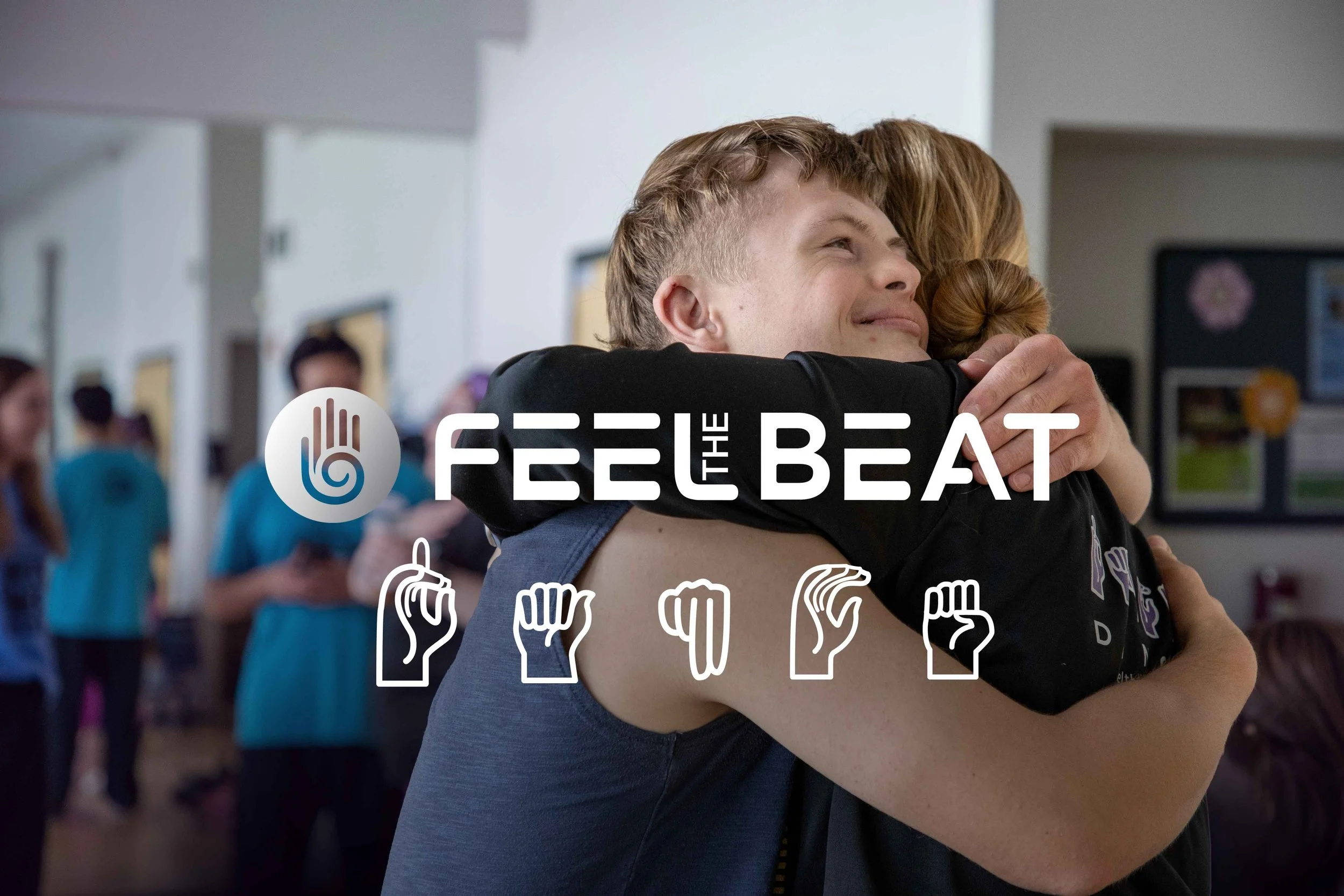
Feel the Beat
One Beat for All
Art Direction
Expressive, Accessible, Rhythmic, Joyful
Services
Brand Identity, Logo Design, Iconography, Design System, Web Design, Campaign Design, Print & Social, Photography
About Feel the Beat
Feel the Beat is a Colorado-based nonprofit and dance studio dedicated to making music and dance possible for those who are Deaf, Hard of Hearing, and those with or without disabilities. What happened in their classes was powerful, but their brand wasn’t communicating it. Dated visuals, inconsistent messaging, and a cluttered website hid the transformation they were creating every day. They needed an identity that families, donors, and partner studios would take seriously, and one that lived up to the accessibility at the heart of their mission.

Logo Suite
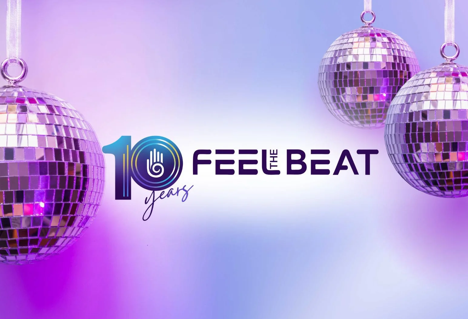
Feel the Beat wanted to keep the hand symbol from their original brand, so I simplified it and added subtle gradients. I paired it with a modern, energetic sans serif and customized it with softly rounded letter caps to echo the brand’s fluid movement. The suite includes a hand-only submark and a special 10-year anniversary logo.


Brand Colors
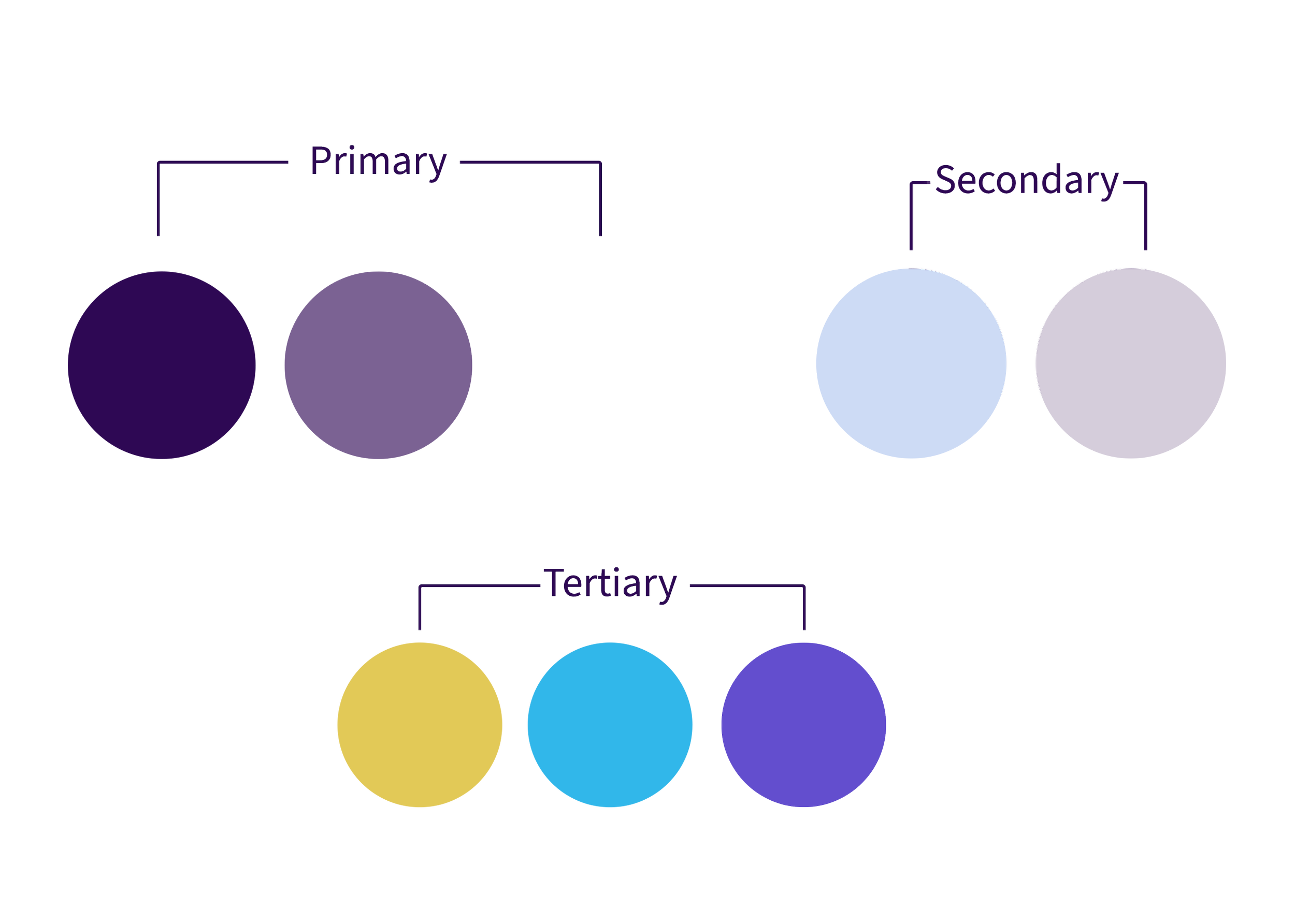
The brand’s signature dark purple stayed as the anchor. A palette that used to be only white and shades of purple now has dynamic, accessibility-friendly pairings, plus tertiary colors saved for specific events and donation campaigns.
Typography
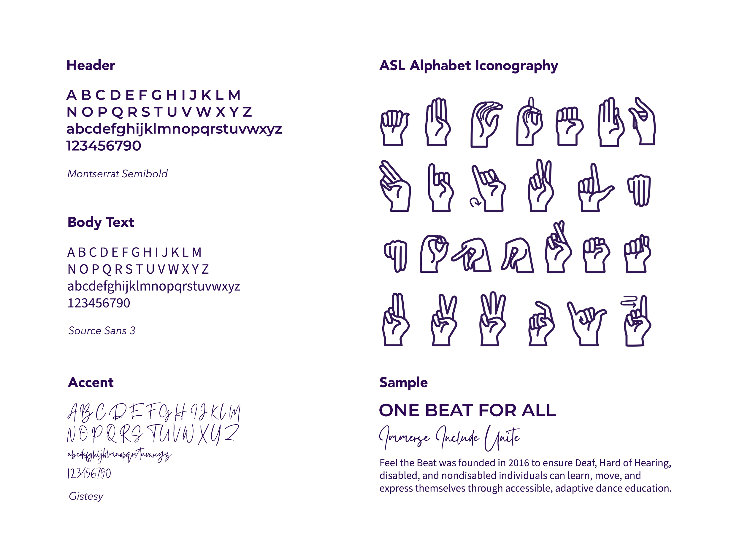
I replaced the brand’s all-serif setup with a clear hierarchy. Montserrat SemiBold gives headlines impact, an accent script adds a personal touch in small doses, and a clean, modern body font keeps copy readable for an audience with high accessibility needs.
ASL Iconography
FTB had been piecing together free ASL icons that were inconsistent and sometimes hard to read. I built them a custom ASL icon set drawn in the same style as the logo’s hand, ready for merch, flyers and more.

Web Design
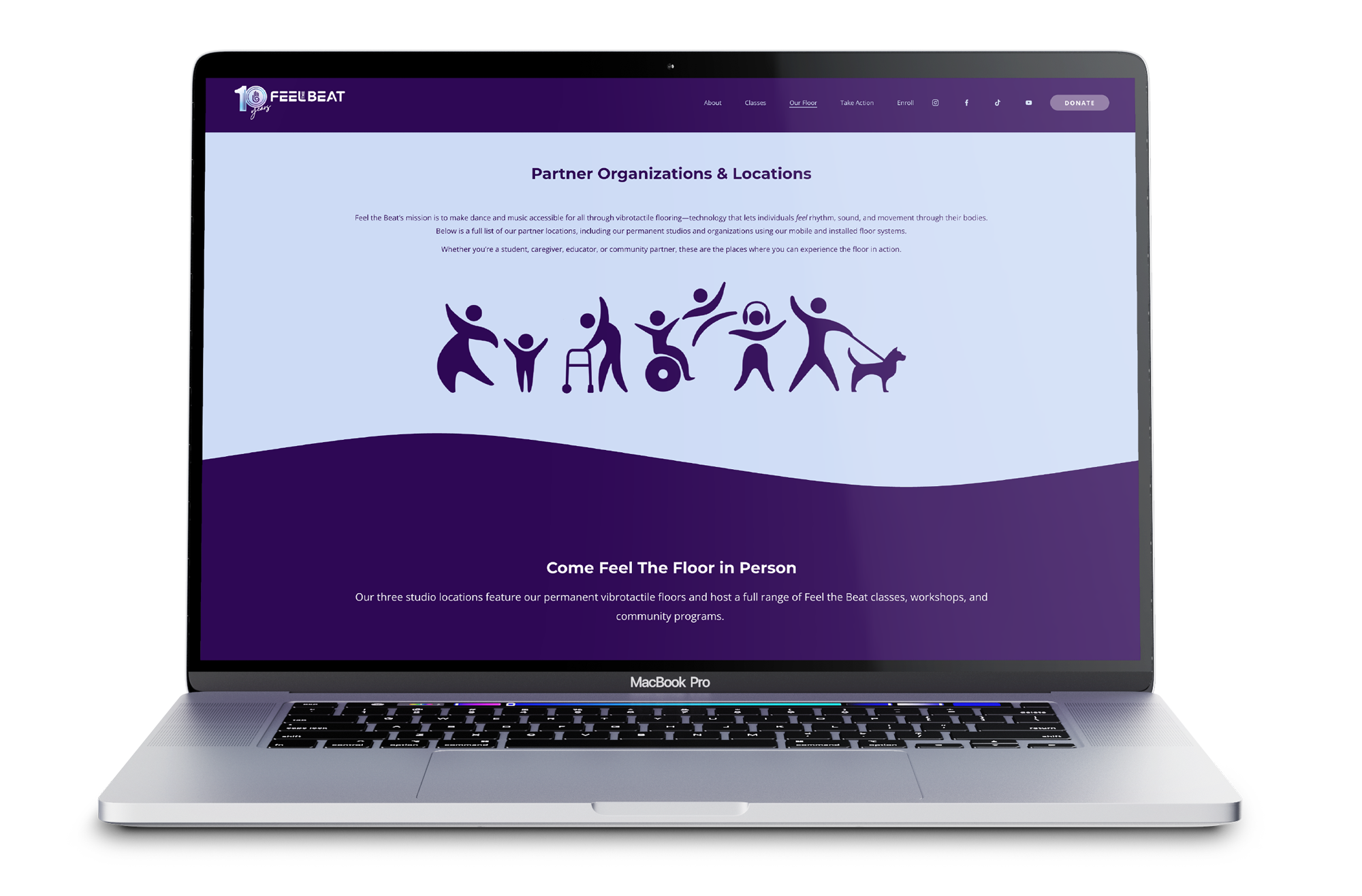
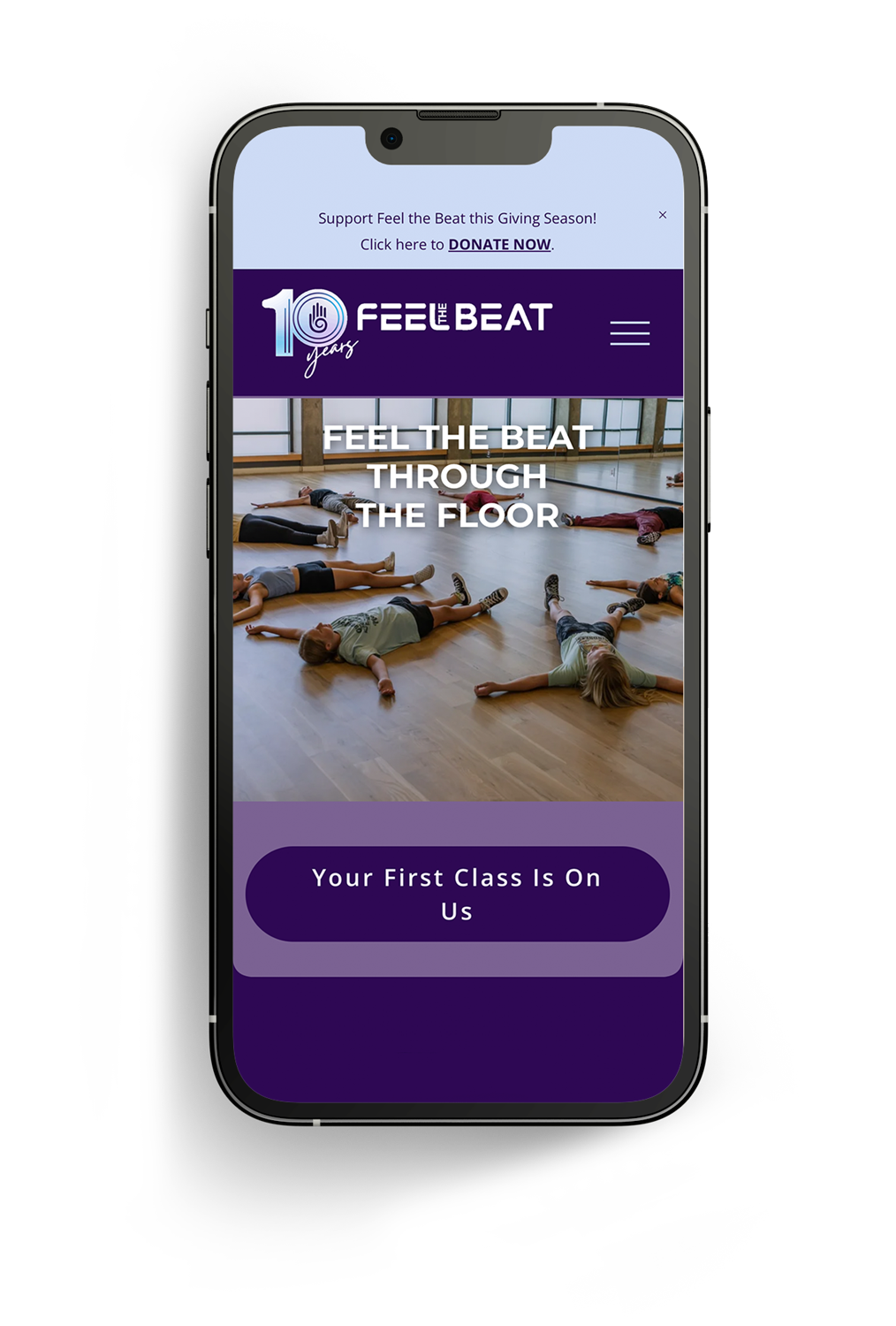
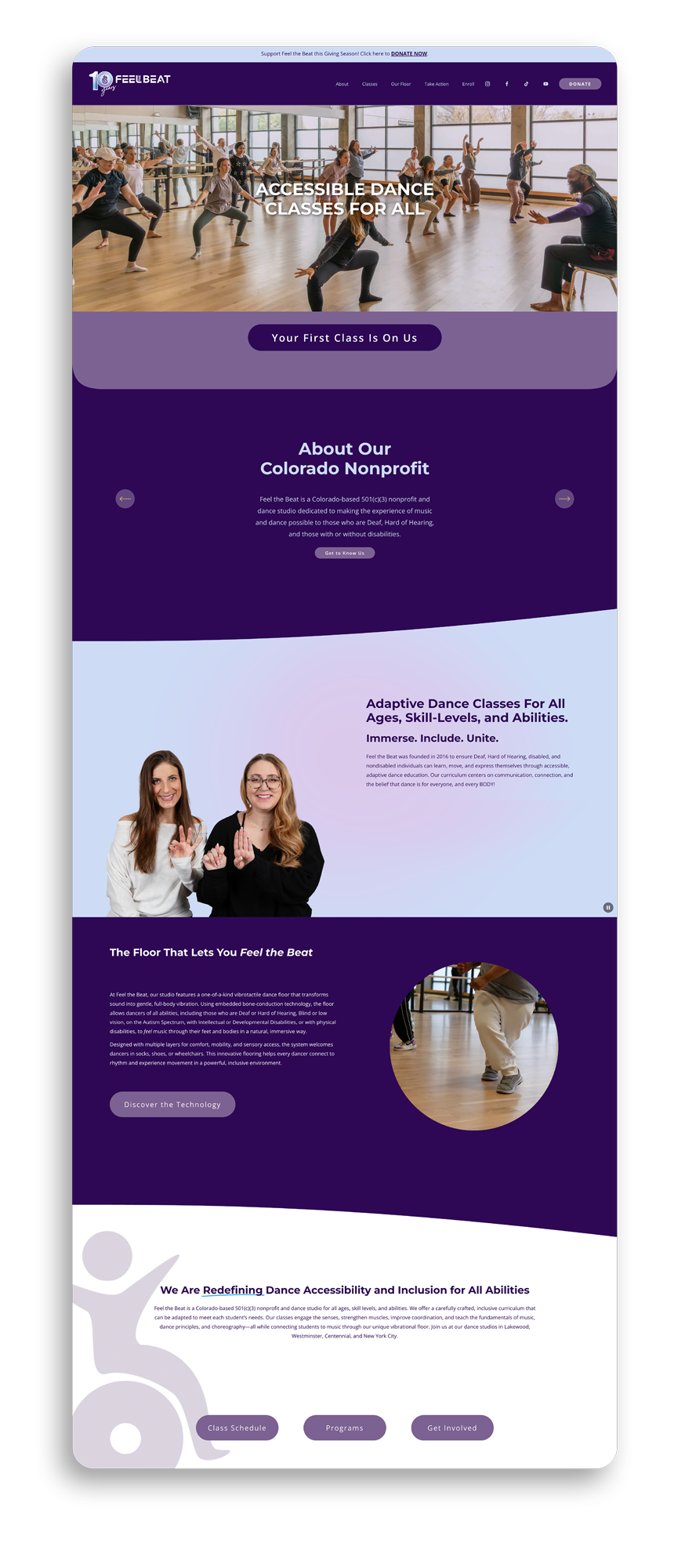
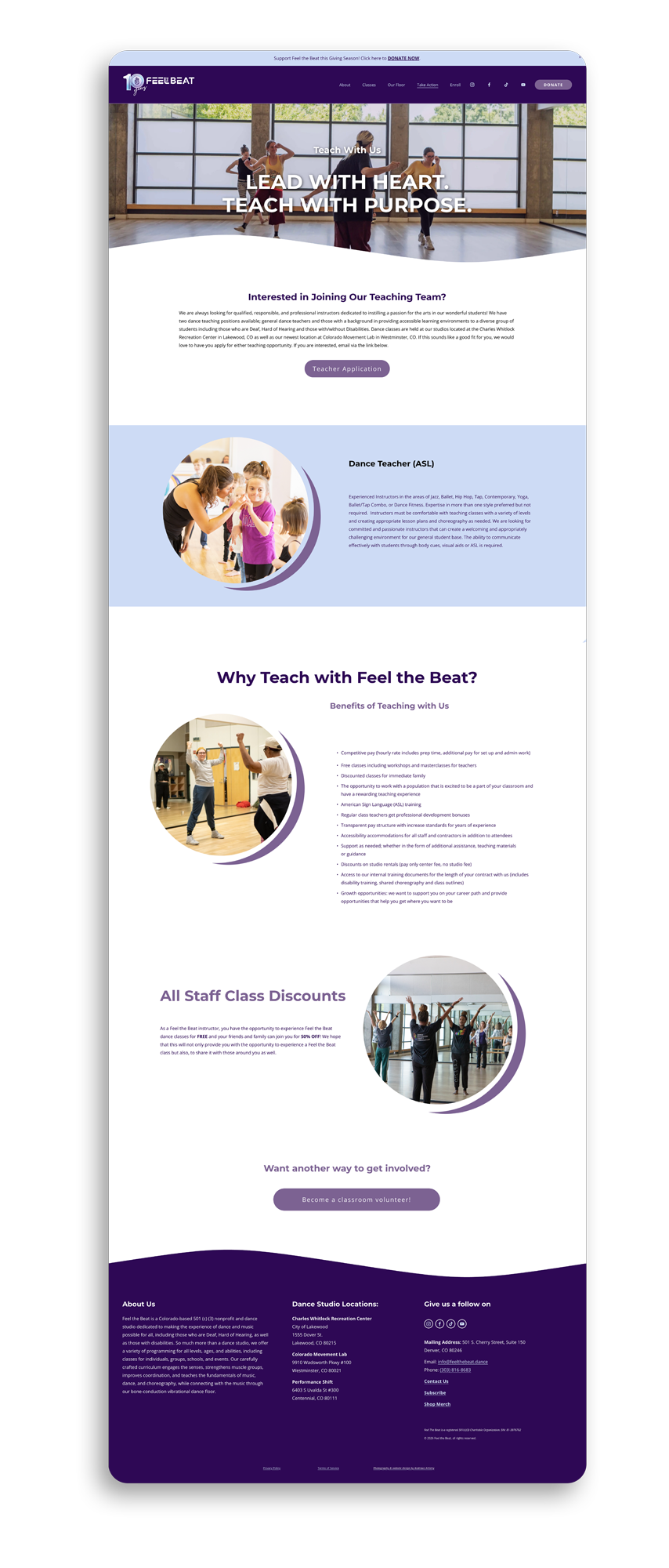
The old site was cluttered with extra pages, and finding where to donate or register for class was frustrating. I streamlined the user journey around those two actions and carried the brand’s forward motion into the design with wave dividers, pill-shaped buttons and fluid circles in nearly every section. Each page opens with a powerful class photo, a reminder of who you’re supporting when you sign up or give.
Social Media
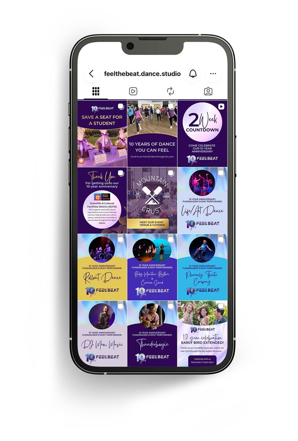
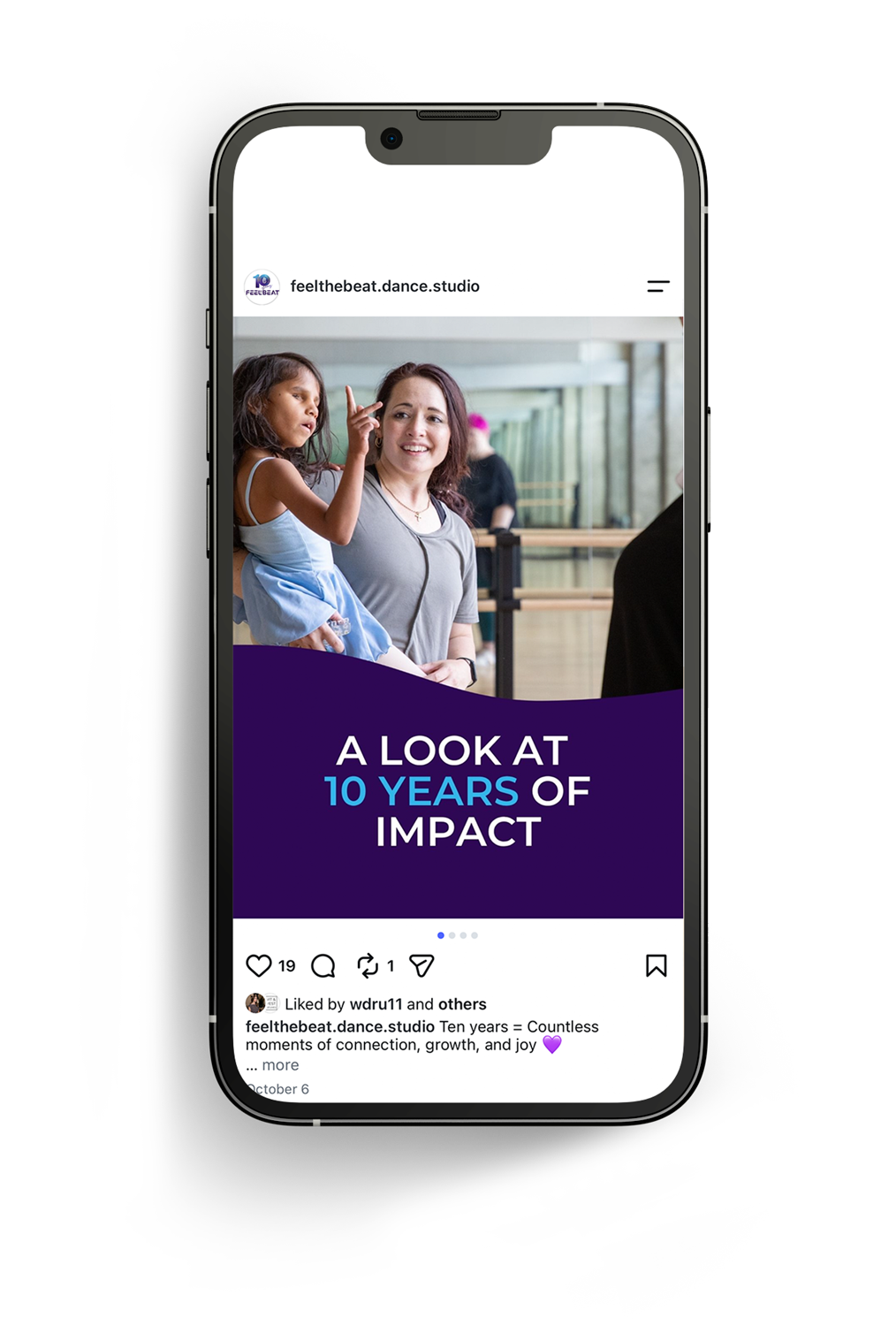
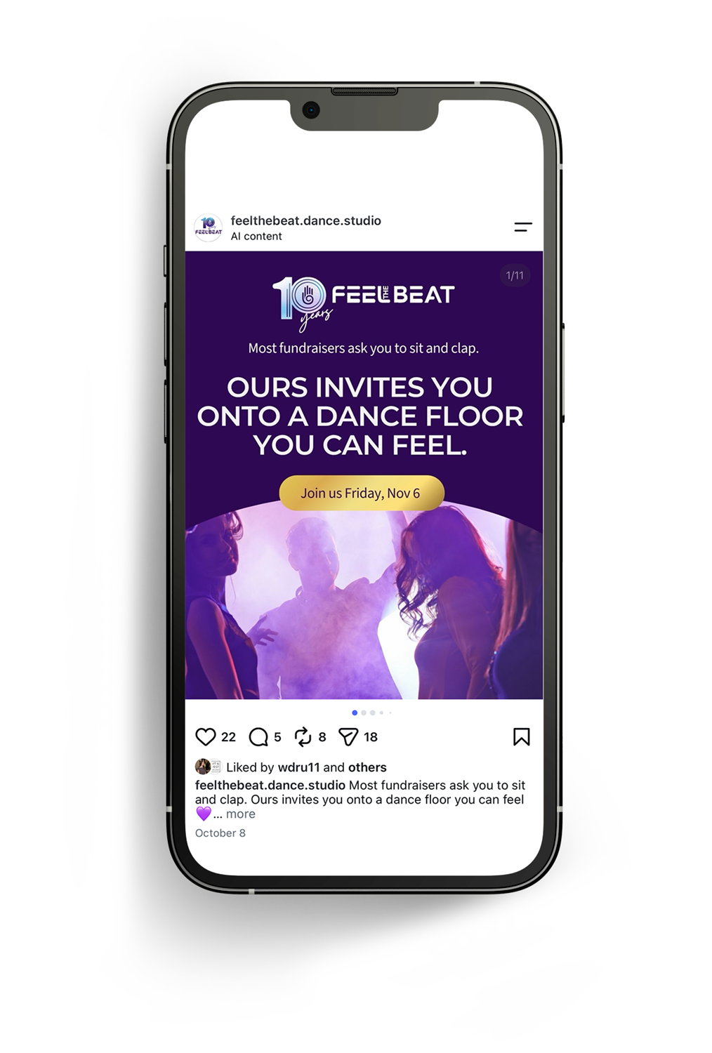
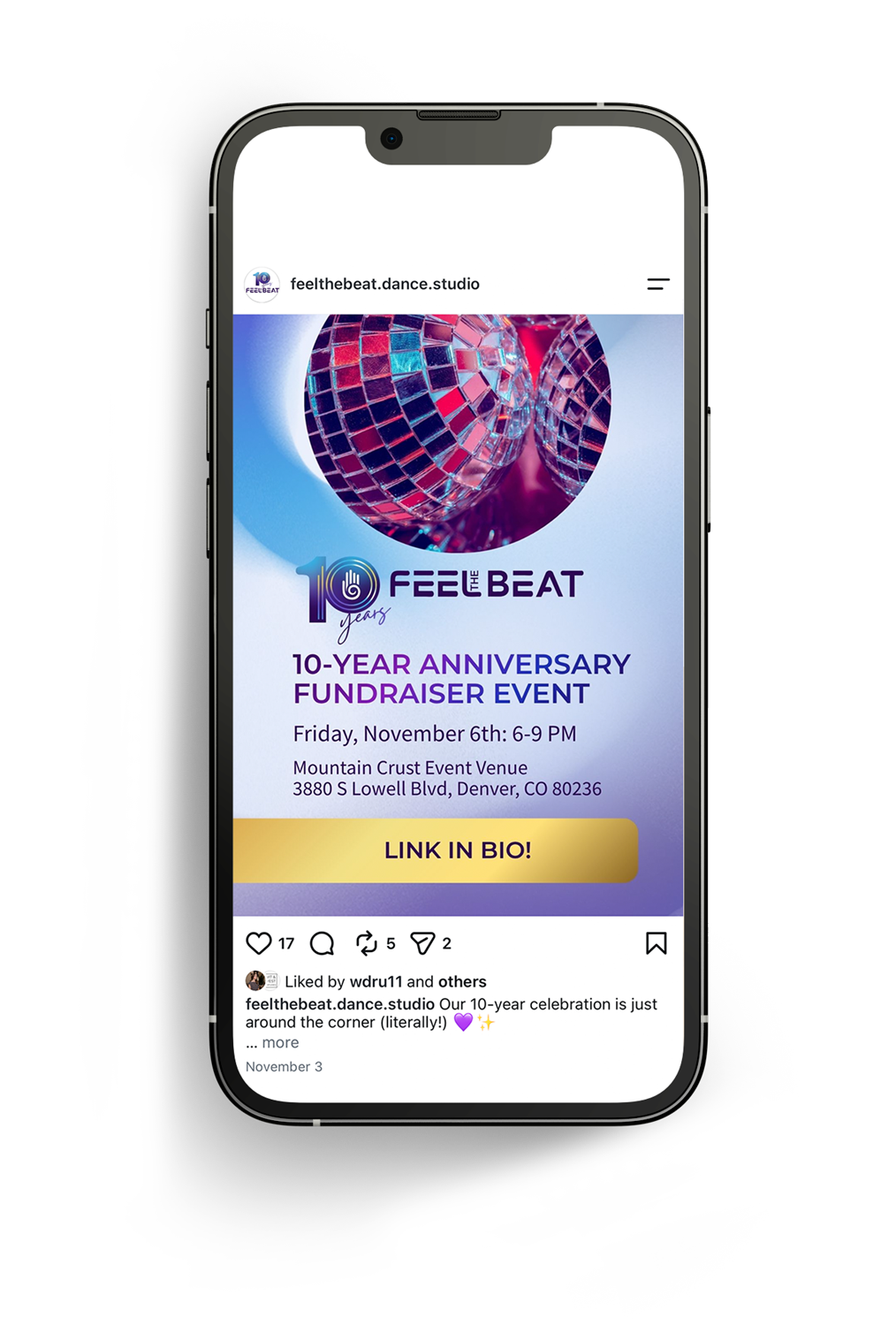
Image-forward templates use fluid shapes to make room for high-contrast, easy-to-read copy.
Print + Merch
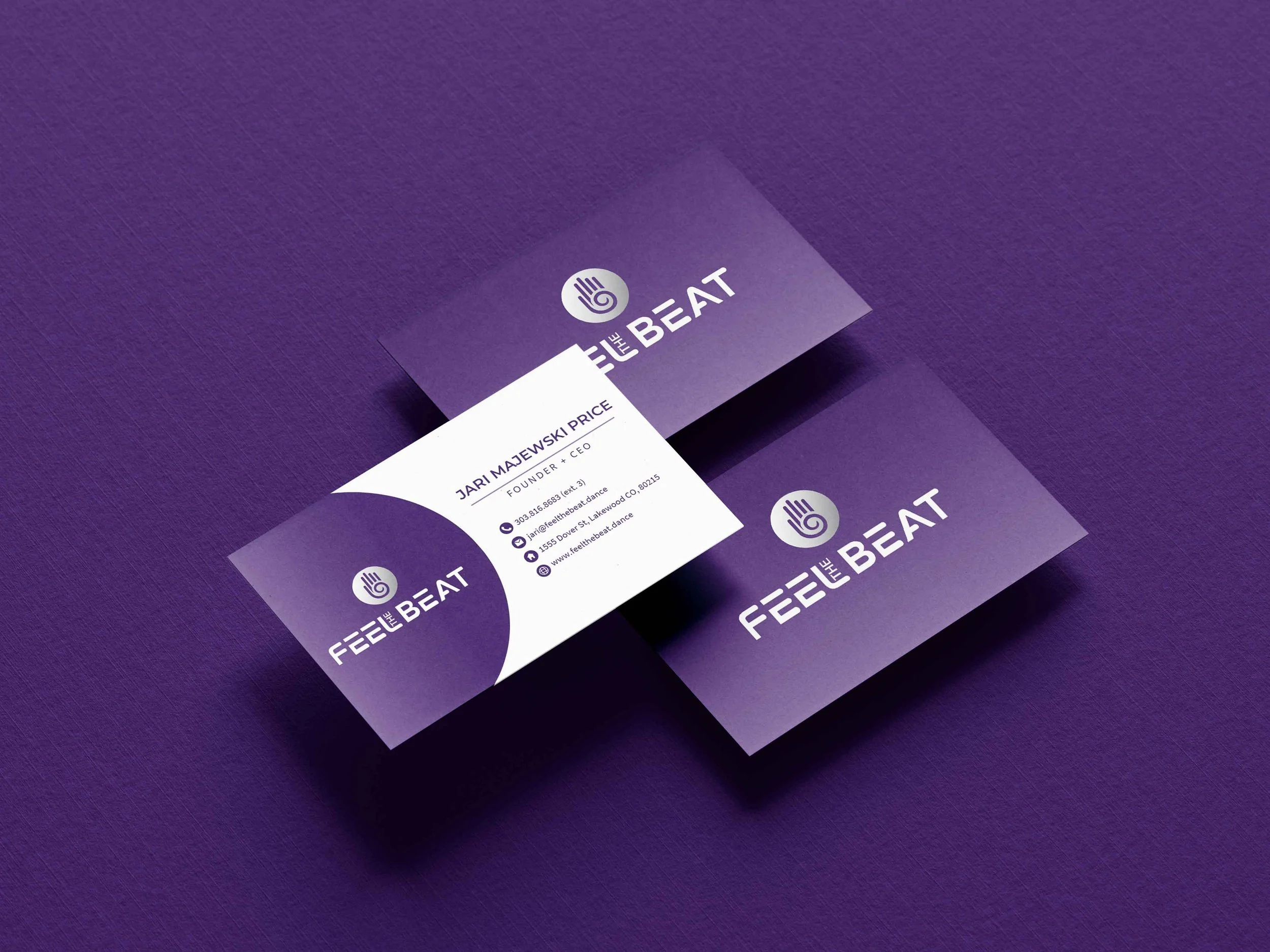
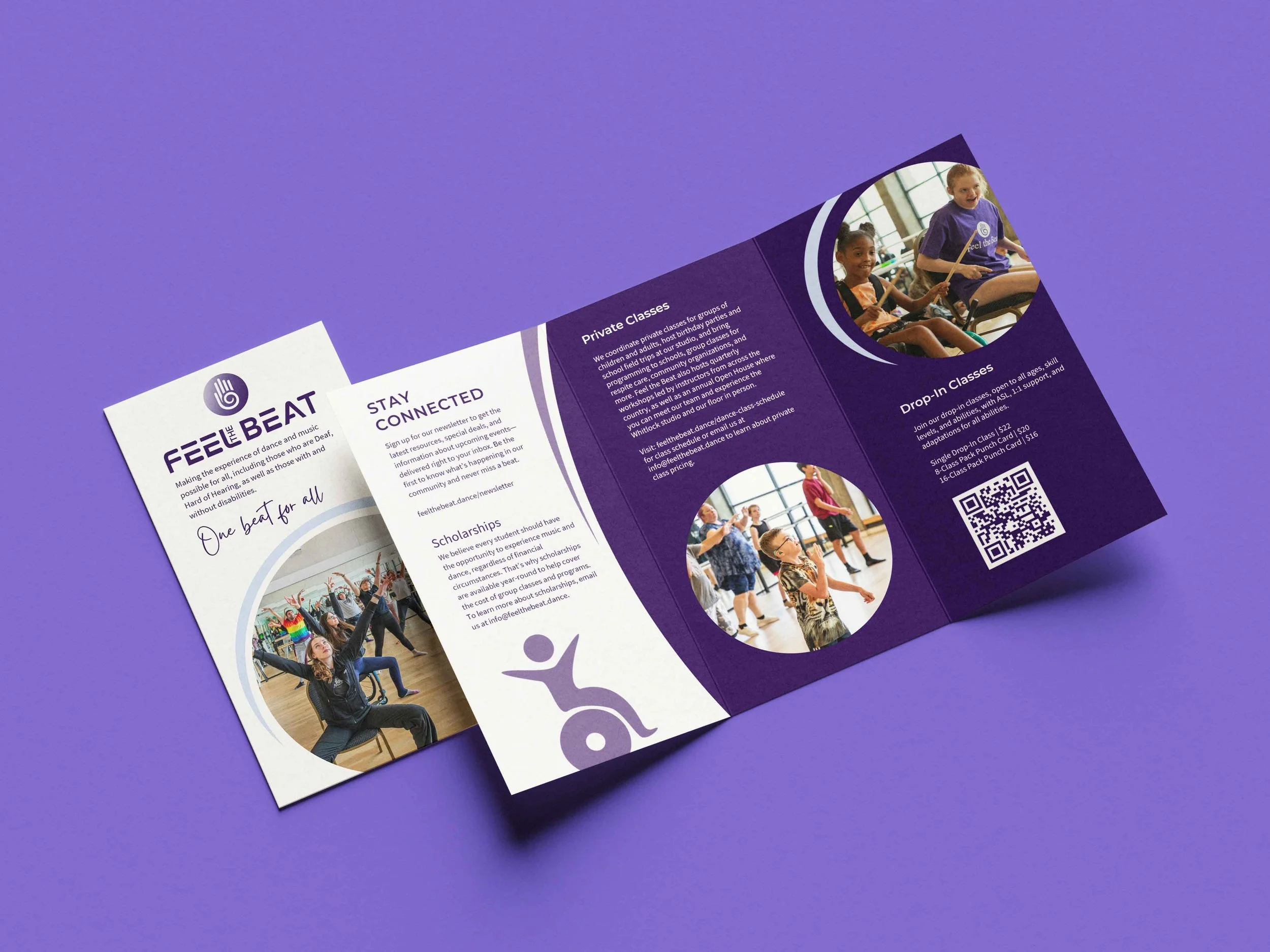
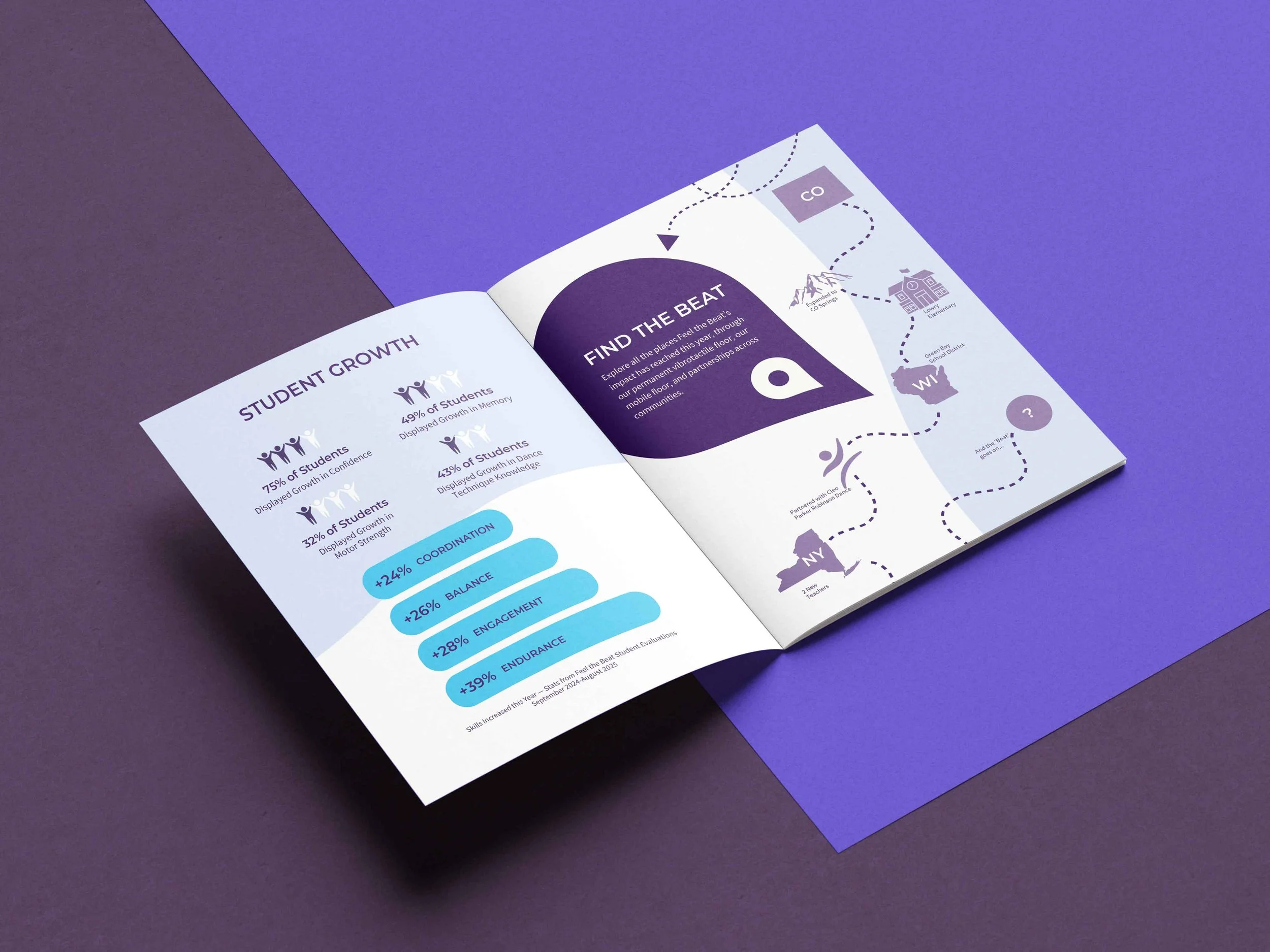
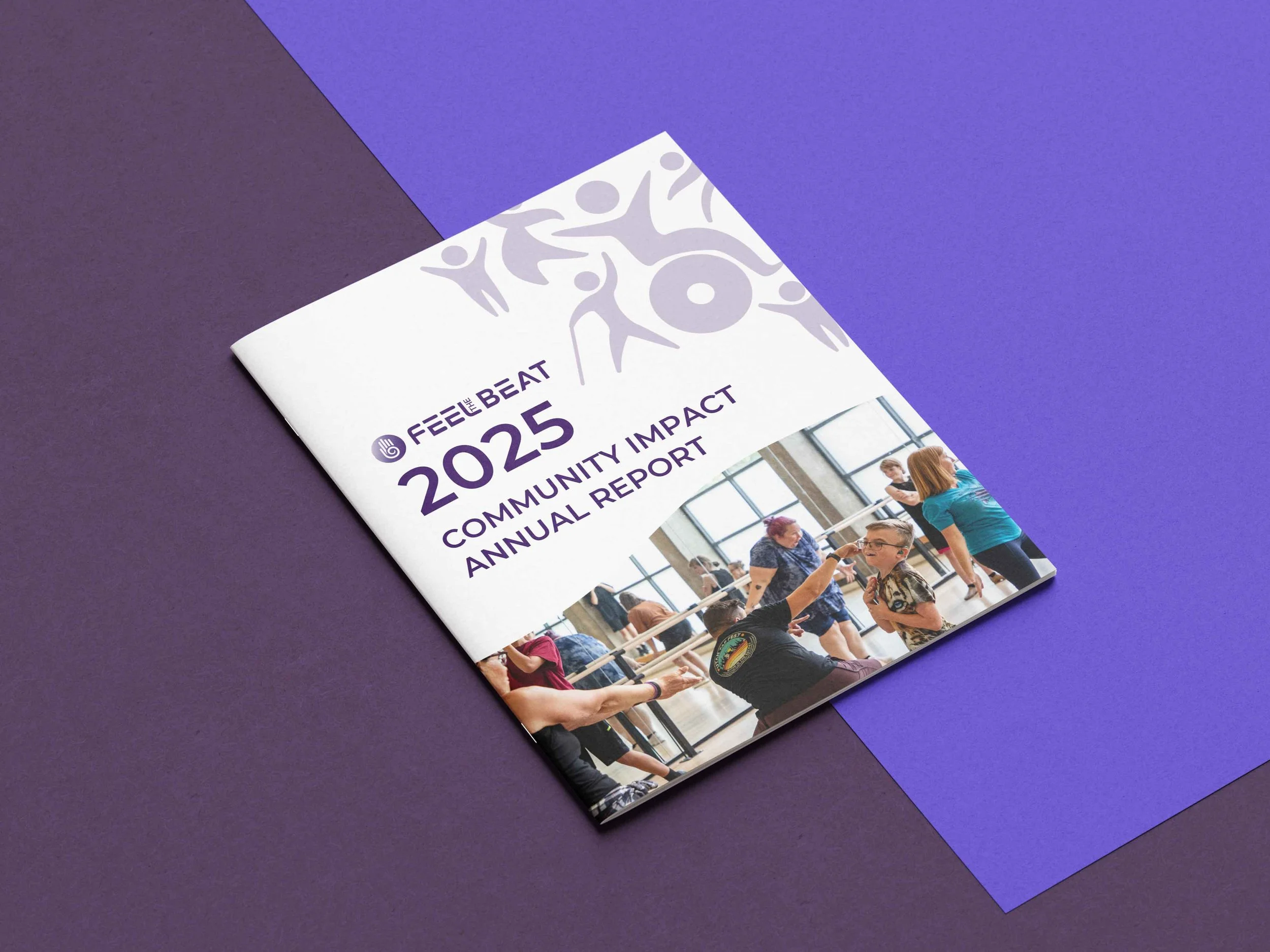
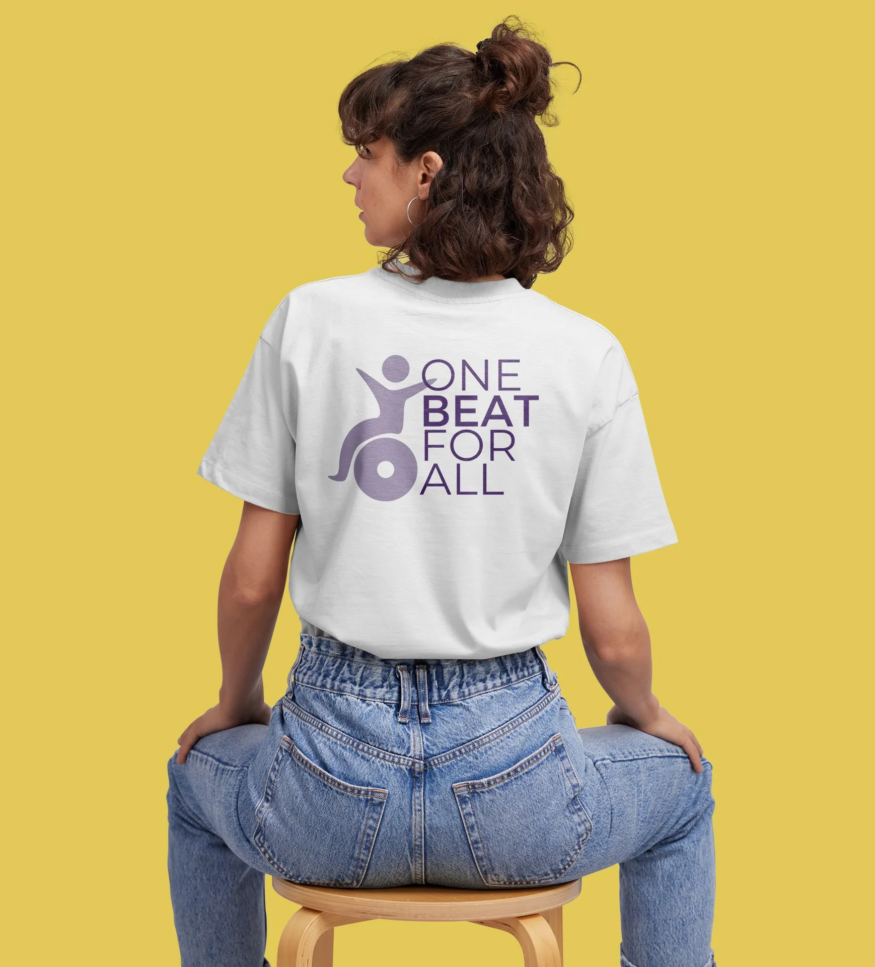
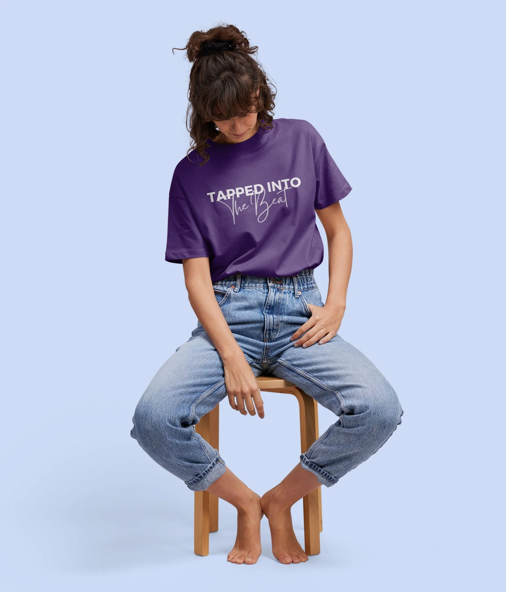
I designed everything from letterhead, business cards and brochures to annual donor impact reports, with clear infographics built from the custom icons. I also made fun merch for students, volunteers and instructors.
Photography
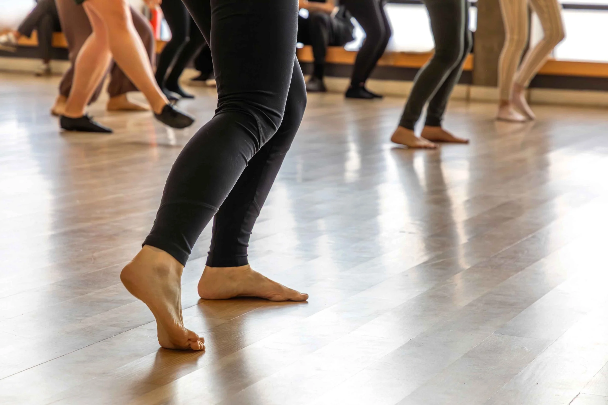
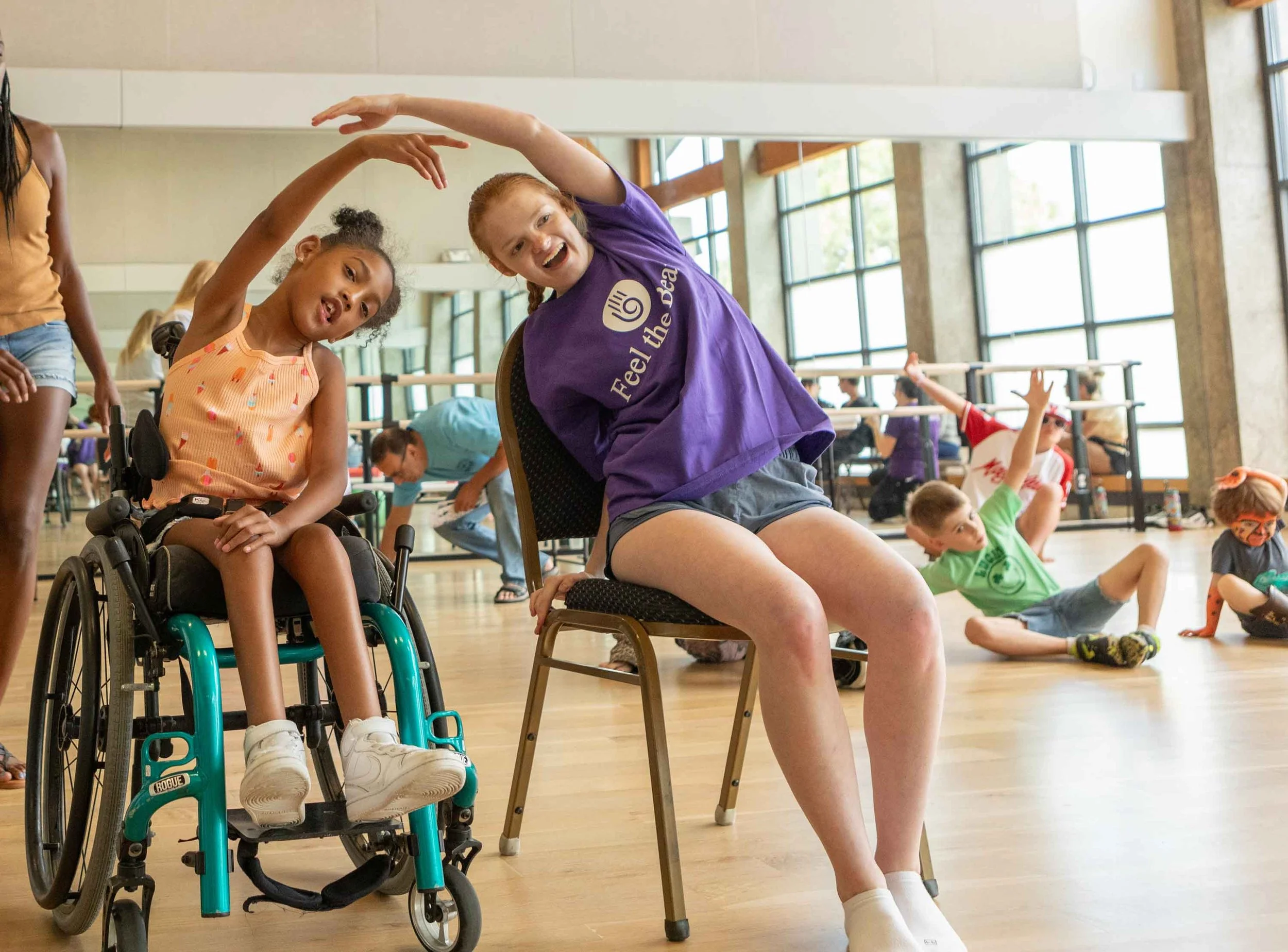
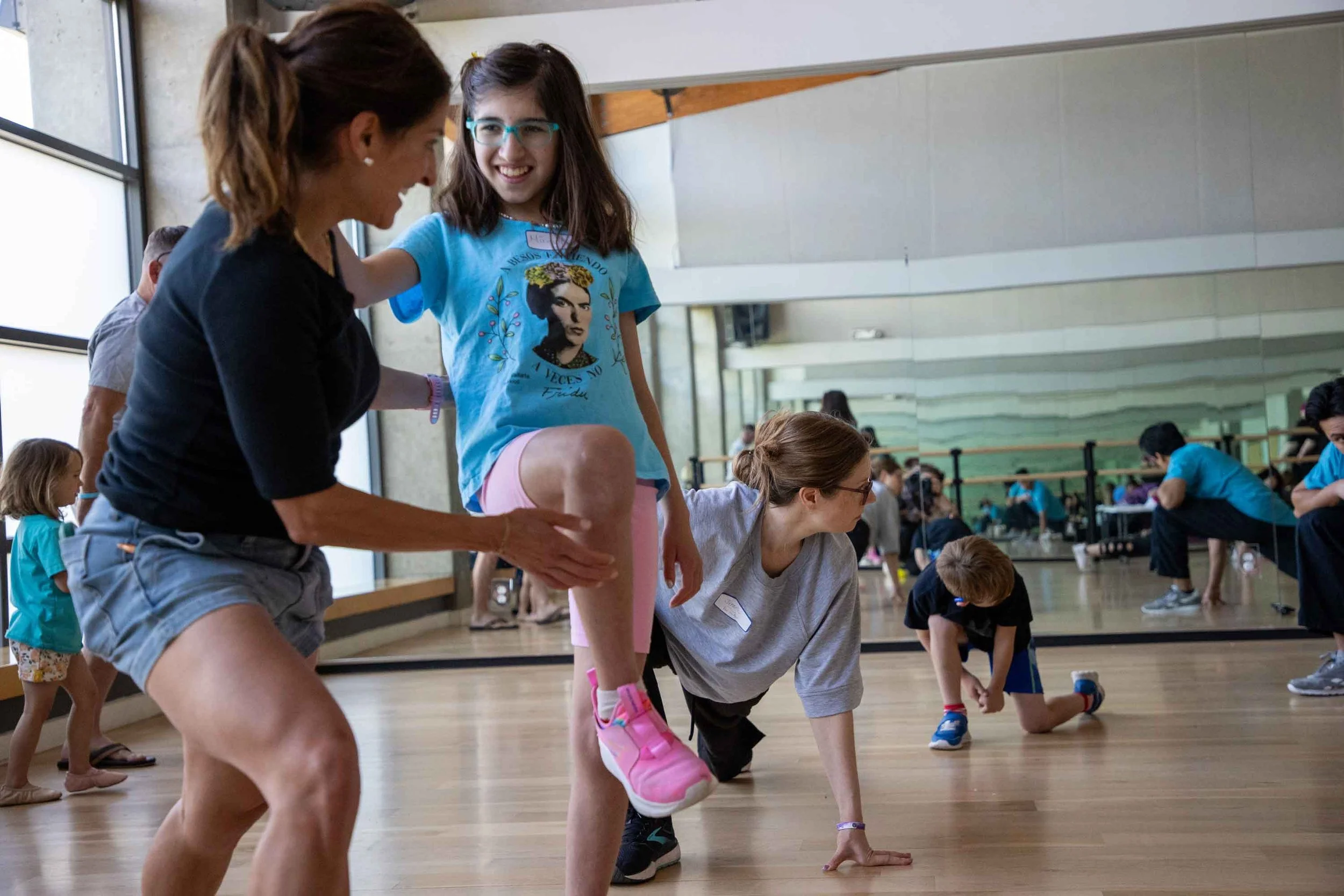
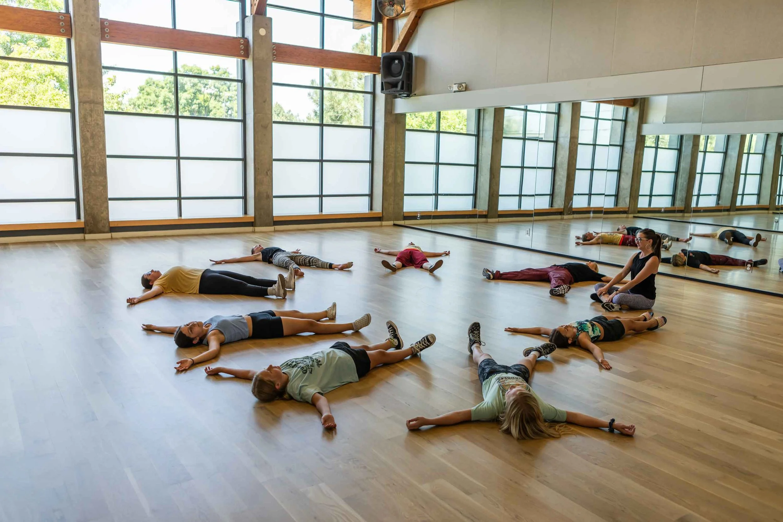
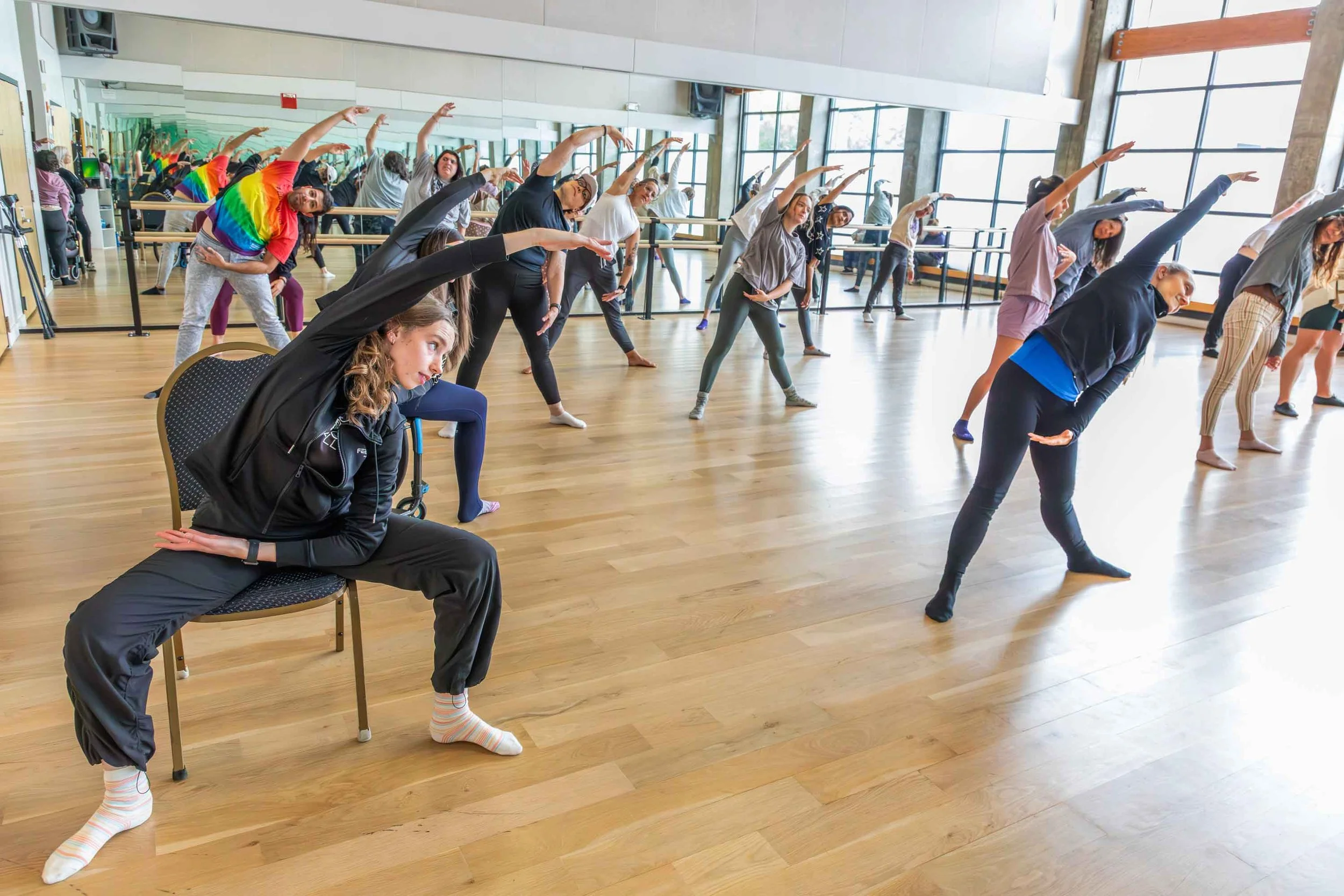
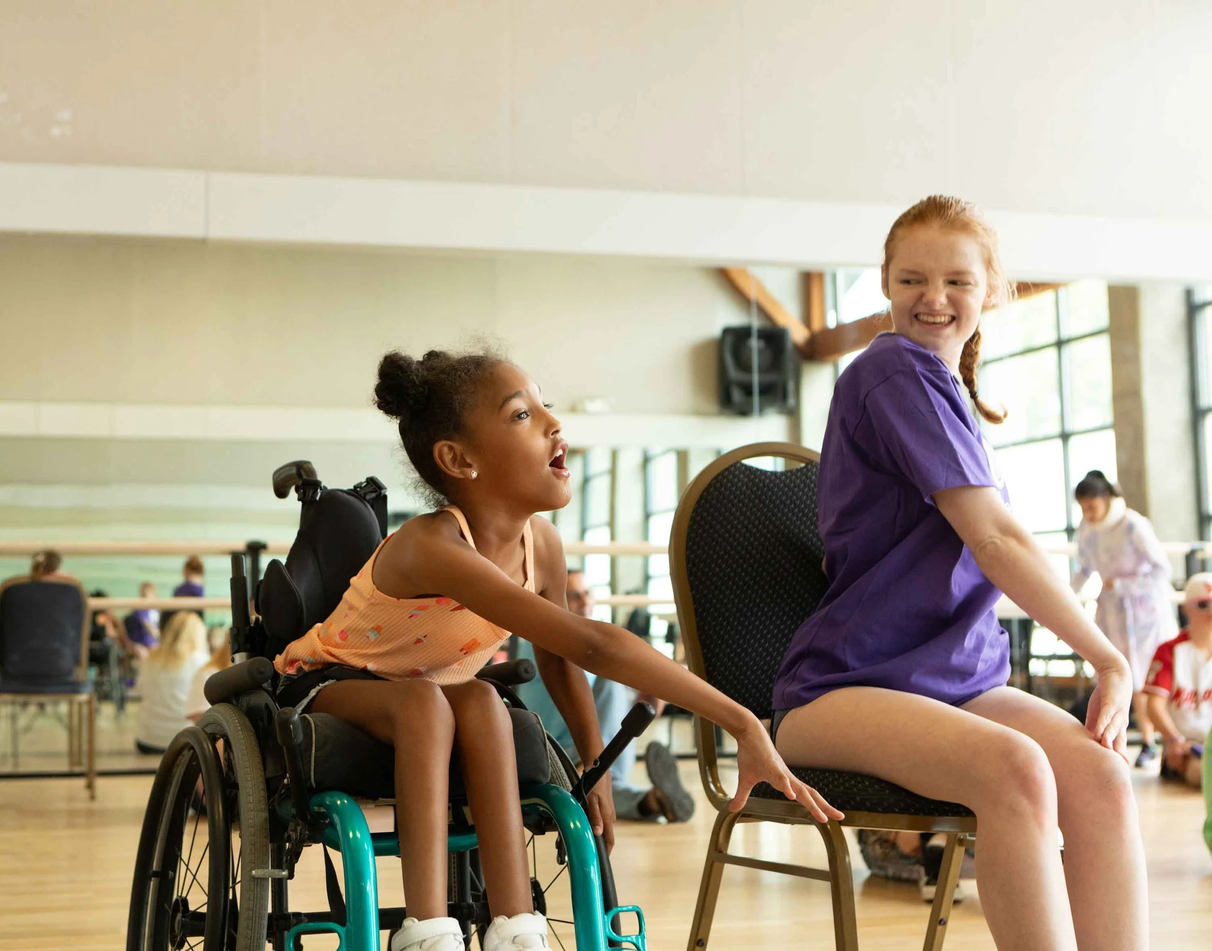
Nothing is posed. The photos capture the real energy and joy of classes and events, so students can see a space where they’ll feel safe and welcome: one beat for all. Close-up shots feature FTB’s patented floor, which lets students who are Deaf or hard of hearing literally feel the music.
The Transformation
Feel the Beat now has a full design system, a library of thousands of photos, a streamlined website and social templates that keep them moving. With all of that in place, Feel the Beat was able to launch their biggest campaign yet, the 10-year anniversary gala, which brought in standout donations to keep sharing one beat for all.